top of page
HireAra Website Redesign
Four versions.
One evolving product story.
a journey from login-first to demo-first website.
Built to move HireAra from a credibility-building presence to a full conversion engine. Owning the complete design scope across four versions, from the early-stage startup narrative through the post-acquisition, turning the website into the product's strongest sales and marketing asset.
What:
When:
Four Verisions: 2023 and 2026
Why:
Build a conversion egine that works as primary asset for sales and marketing
Link:

00:00/00:00
41×
Main conversion CTA : Virtual Demo CTR lift across versions
477%
Growth in unique visitors from
early-stage to post-acquisition
20%
Global market growth:
US & APAC since launched in Q4 of 2025
From awareness to conversion
Each version of the site had a different primary job, shaped by where the company was at the time:
Version
Period
Primary Objective
Key Design Changes
V1
Jan 2024
Establish a credible online presence for an early-stage product.
Clean, solid-colour minimal design. Product kept mostly off-screen as confidence built.
V2
Mar 2024
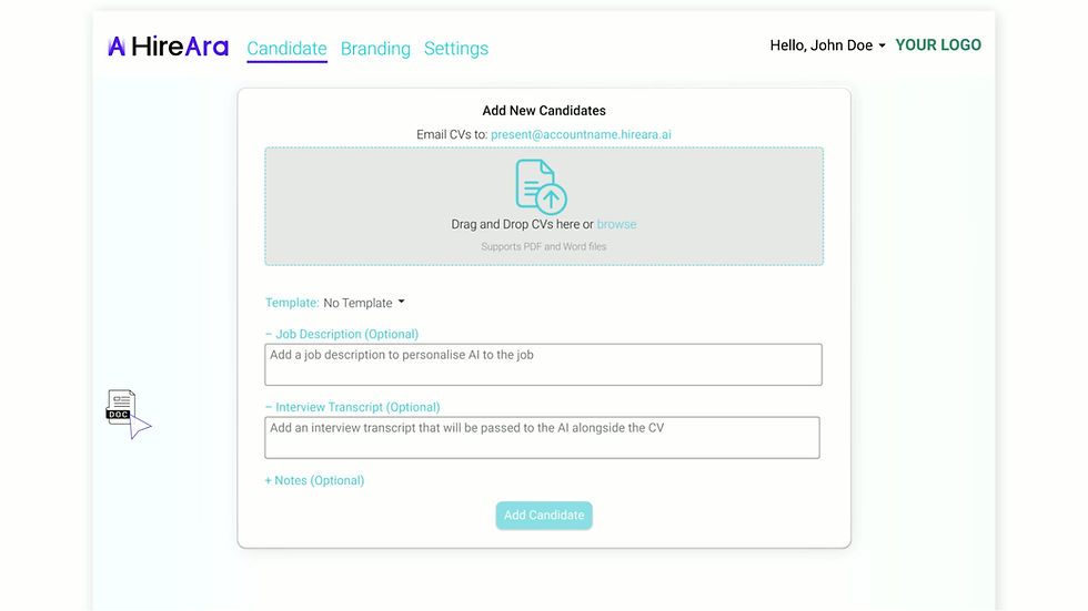
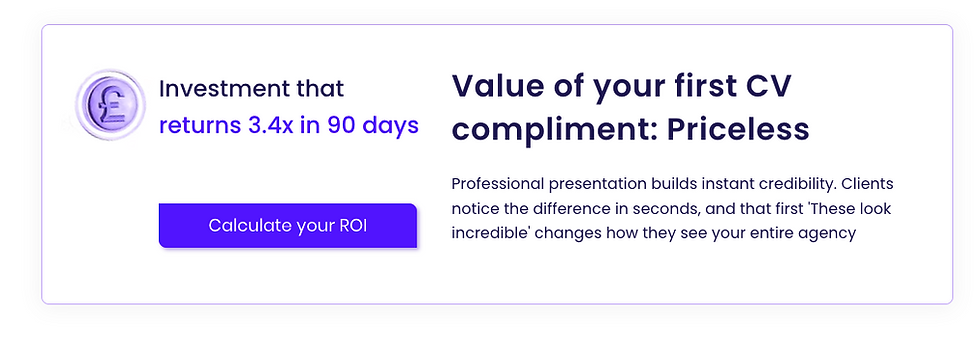
Convert awareness into demo bookings; introduce demo video, virtual demo, ROI calculator and referral
ROI Calculator and Refer a Friend added. Video and Interactive demo introduction. Demo driven focus.
V3
Jul 2025
Post-acquisition refresh; transition into new brand assets to show collaboration
Virtual Demo and Book a Demo as a main CTA. Updated brand assets to reflect Access Group ownership
V4
Mar 2024
Video-first, social proof at the centre of the narrative along with product focus layout
Video and motion driven narrative. Customers page elevated. Product-in-focus layouts.
The site's design changes shows how the product journey changed from a startup careful about what it showed, to a mature product with a bold story it was proud to tell. Every layout decision, CTA placement, piece of content was made with one question in mind: does this get a recruiter closer to booking a demo?


Tagline testing
The homepage tagline was tested across four directions:
-
product-led
-
emotional-led
-
commercial-led and
-
conversion-led
Each one shifting not just the headline but the entire page hierarchy beneath it. Every angle was a different bet on what would make a recruiter stop

CTA evolution and Feature videos
As the product's commercial priorities shifted, so did the primary CTA
V1
Primary CTA: Book a Demo
V2
+ ROI Calculator
+ Virtual Demo
V3
+ Refer a Friend
V4
+ Demo Video
along with Virtual demo
Two conversion paths introduced with Book a Demo as primary CTA
2 main CTA Book a Demo and Virtual Demo moving towards low friction
Video centric, self guided
Lowest-friction entry point added

00:00/00:00

A product & feature focus narrative
00:00/00:00


The Outcome
A site where every scroll had a purpose. Content written for the website became the brief for social. Campaigns built on the site drove traffic back to it. The sales and marketing loop ran through the same pages, the same copy, the same creative, continuously feeding each other.
Navigation architecture
The site as a sales + marketing engine
move prospects through a sales funnel and act as a live marketing platform that kept the brand visible, credible and converting between conversations.
Sales
Marketing
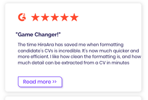
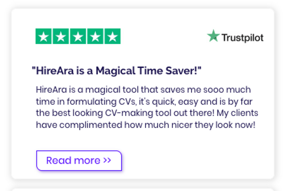
Visitor types: a prospect, an existing customer and an enterprise buyer each had a clear navigation path.
The site was built to stop people mid-scroll and give them a reason to stay.
SALES ENABLER
CREATIVE CONTENT








Watch a Demo
0
4%
Session per day
~92
~164
40 x growth
Metric
V1 baseline
V4 current
Direction
Virtual Demo CTR
0.1%
4.1%
Login CTR
20%
6%
Conversion focused
Paid Search
6.9%
23.3%
33% reach increased
Customer Page views
100
2,608
(top 3 page)
Validating investment
International Traffic
~6.5%
~15.8%
Global reach built
77% increase in daily traffic
New low friction asset
analyticaL breakdown
The Results
The result of four homepage redesigns, each one asking the same question: does this get a recruiter closer to booking a demo?
The homepage analytics across all four versions is a result of deliberate rounds of CTA restructuring, visual hierarchy changes, and content prioritisation that moved the homepage from a
login-first to demo-first website.

00:00/00:00
bottom of page