
HireAra Brand Story
building a brand from ground up to Acquisition
Great products deserve an identity that matches their ambition. HireAra had the product. It needed the BRAND. I rebuilt it from the ground up, redesigning the logo, crafting a custom typeface, motion systems, and comprehensive brand guidelines that ran through every touchpoint: website, UI, marketing campaigns, sales dashboards, and social presence.
The result: an emerging SaaS platform with the visual authority to win market trust, compete at scale, and secure a successful acquisition.
From Startup to Standout
What:
When:
From a Scrappy Startup Days to Acquisition & Later...
Why:
Design confidence turns great products into market leaders.
Link:

Old > New HireAra Logo Post.mp4


Modern, Modular, Market-Ready
For young startups the product often moves faster than the brand.It was the same for HireAra. I began by gathering founder stories, stakeholder insights, brand vision, and studying the existing logo. Then built moodboard, ran trend analysis and market research before landing on a custom typeface, tweaked to be edgy (new-kids-on-the-block narrative) and
curvy (moving cohesively with tech and AI).
It made the logo distinctive enough to be recognised and versatile enough to scale.
edgy

curvy


The custom typeface became the visual signature for the entire brand: website assets, product UI, ad-creatives, videos, social templates, sales decks. Everywhere the brand showed up, these letterforms led.

Bringing it all together with Brand Guidelines
I produced the full range and made sure every channel spoke the same language. It's the moment when someone sees a LinkedIn post or an ad, clicks through to the website, scrolls through website content and logs into the product and all of it feels like the same brand. That's what I was building toward.

FOUNDATION
The Foundation serves as the visual and core of the Design System. It defines the fundamental design principles and assets that ensure consistency, coherence and alignment with the brand identity across all touchpoints. By establishing a clear set of visual rules and styles, it allows teams to create intuitive, accessible and scalable user experiences with confidence & efficiency.

Logo

Colour

Icons

Typography

Visuals

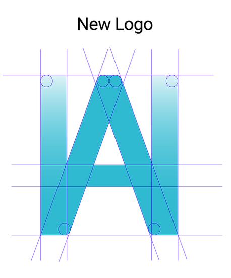
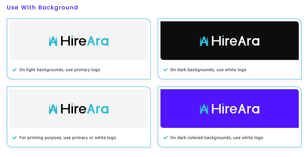
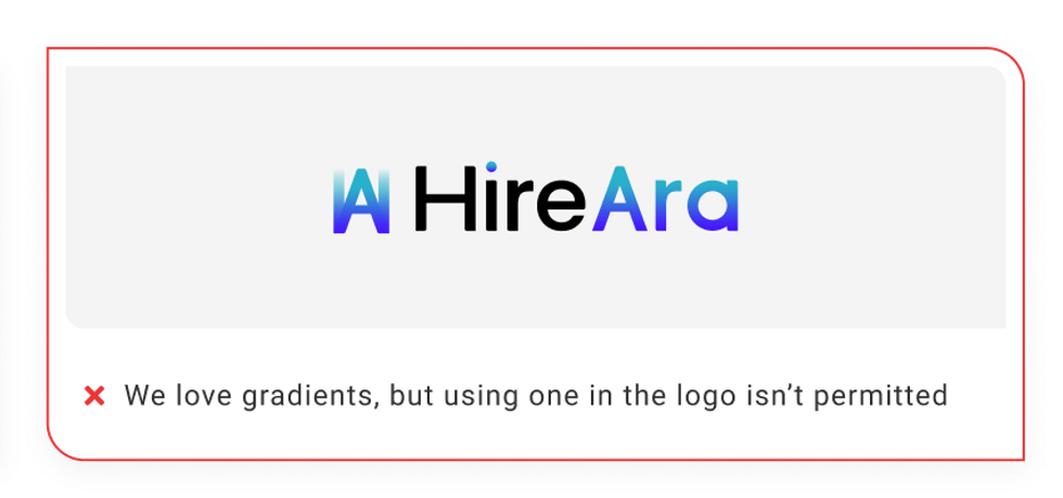
The logo is a key representation of the brand's identity and values. It plays a vital role in creating recognition and trust across all digital and physical touchpoints




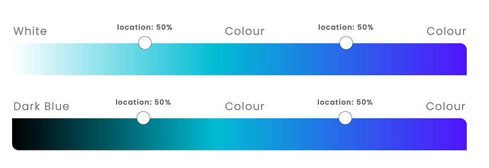
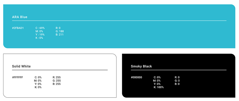
Colour system that's organised into clear categories (such as primary, secondary, neutrals & functional states) to make it easy to apply consistent styling across the entire design system.



PRIMARY COLOUR
SECONDARY COLOUR
NEUTRAL COLOUR
GRADIENT COLOUR
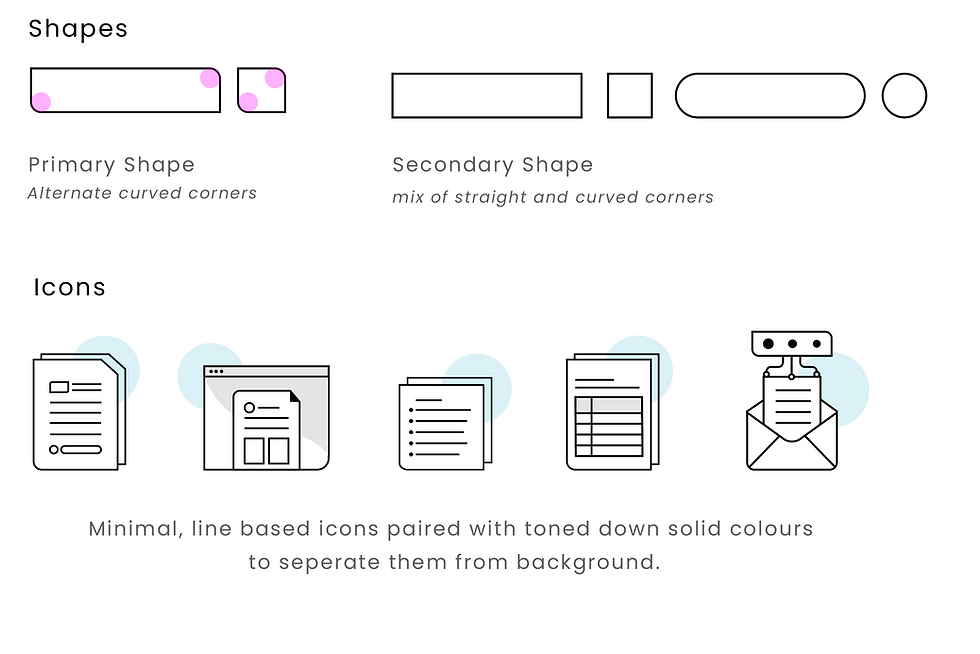
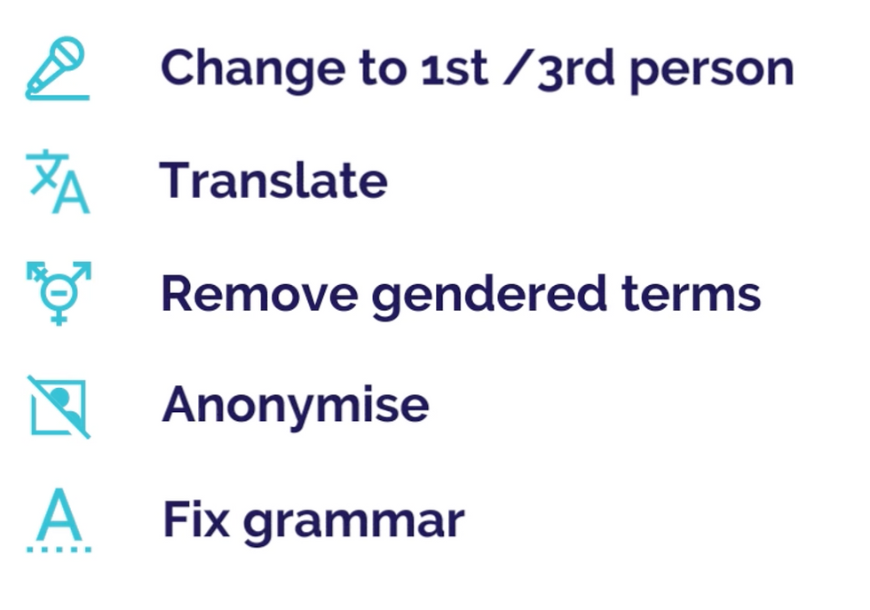
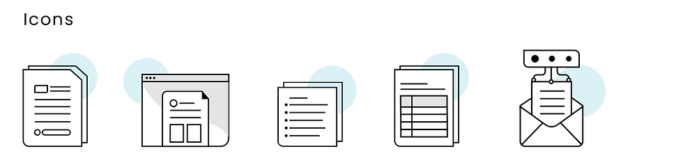
Icons are visual representations of actions, objects or ideas that enhance usability by providing quick recognition and reducing the need for text. Help users navigate interfaces, understand functionality & interact more efficiently




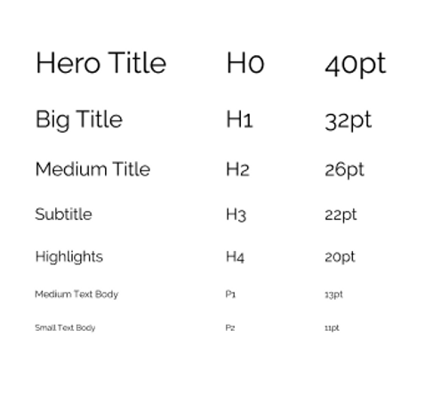
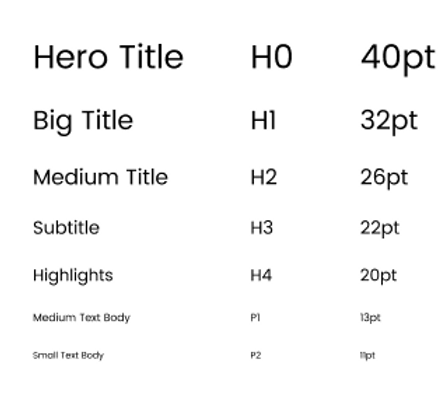
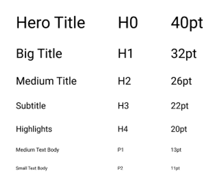
Typography is the voice of a brand while typeface carries tone, builds hierarchy and guides the eye through a page with intention. It shapes how content feels, how fast it scans, and how much a viewer trusts what they are looking at.
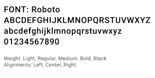
PRIMARY TYPEFACE
Primary typeface is the main font that defines the overall tone and visual character of the interface, contributing to both readability and brand identity. Support a full range of weights and styles (eg. regular, medium, bold) for clear typographic hierarchy and flexible design layouts
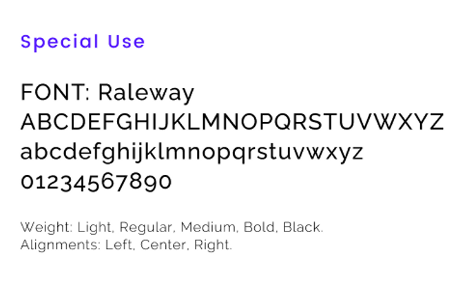
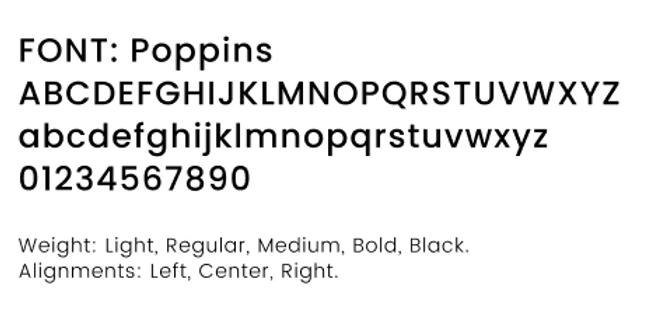
Secondary typeface complements the primary typeface and introduce visual contrast and highlight distinct design elements. It helps differentiate section of interface, such as quotes, captions, metadata or header in harmony with the type system.
SECONDARY TYPEFACE - BODY TEXT

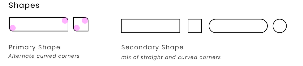
Brand visuals are the first thing people see and the last thing they forget. Every colour, shape and image choice builds recognition, sets tone and makes a brand feel consistent across every touchpoint it appears on.

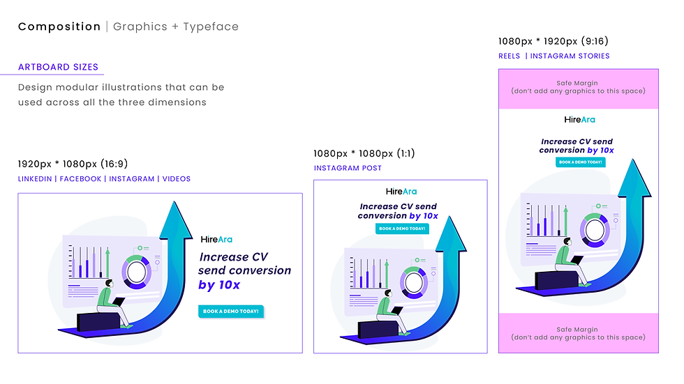

Designing for scalability, growth and standing out!
It was important that the brand identity was versatile enough to flex across every context from a organic Linkedin post to website, a social ad to an in-product experience without losing its voice or visual consistency.

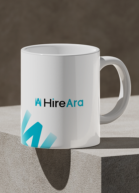


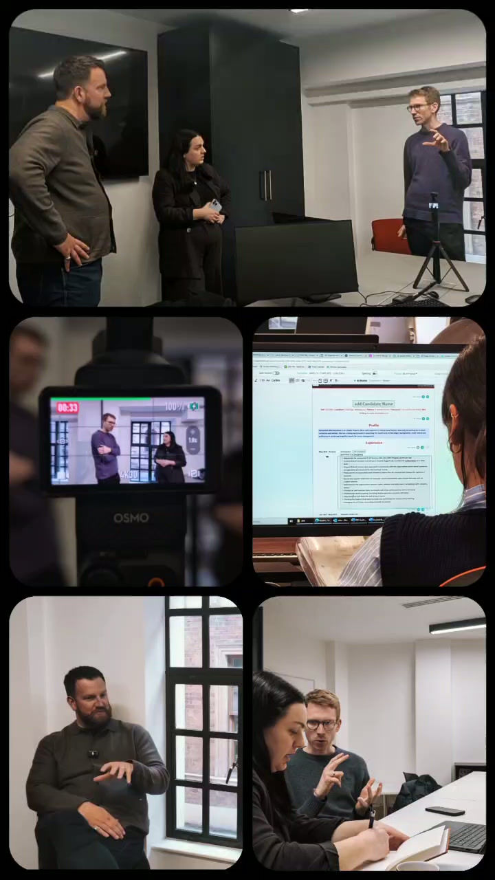


A Rebrand That Helped HireAra Get Acquired

In October 2024, The Access Group acquired HireAra. Corporate acquisitions are where most startup brands go to die is a common sentiment. But that didn’t happen!
The visual language, brand guidelines and motion system built from scratch are still in use across the product, website and marketing output today. The colour palette was adapted to sit within the Access Group family, but the identity that made HireAra recognisable remained intact. The curved and edgy visual language, the UI components, the motion system, the tone of voice. All of it still there. Still working. Still distinctly HireAra.
Post Acquisition
brand adaption and integration
MARKETING COLLATERAL
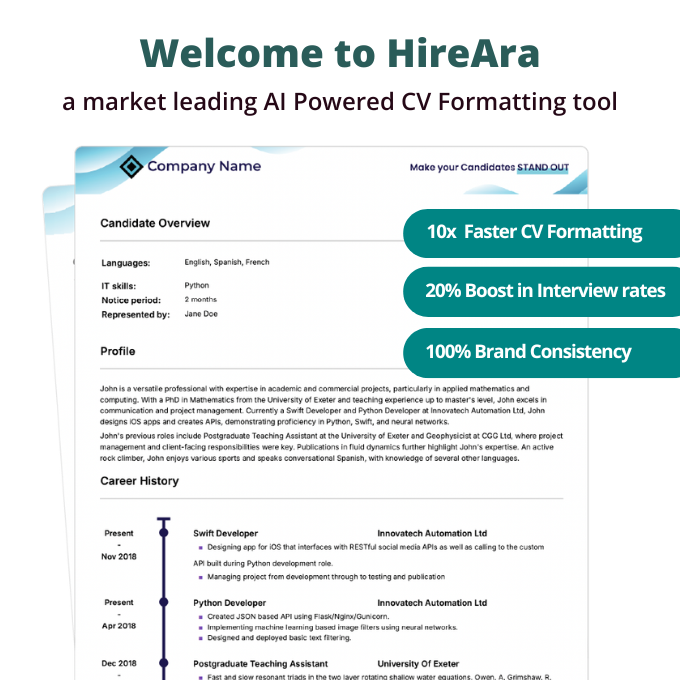
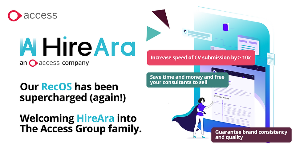
PRESS REALISE


ACCESS NEWSLETTER
ACCESS WEBSITE - HIREARA
Founder Story from Startup to Aquisition
Put sound on to hear the story!
Brand in Action from Screen to Scroll
The brand identity was then applied everywhere from product interface to campaign creative, website to motion, to every touchpoint designed.
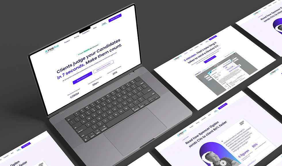
Website Re-design
Four versions. One evolving product story, shifting from login-first to demo-first, lifting the primary CTA by 41×
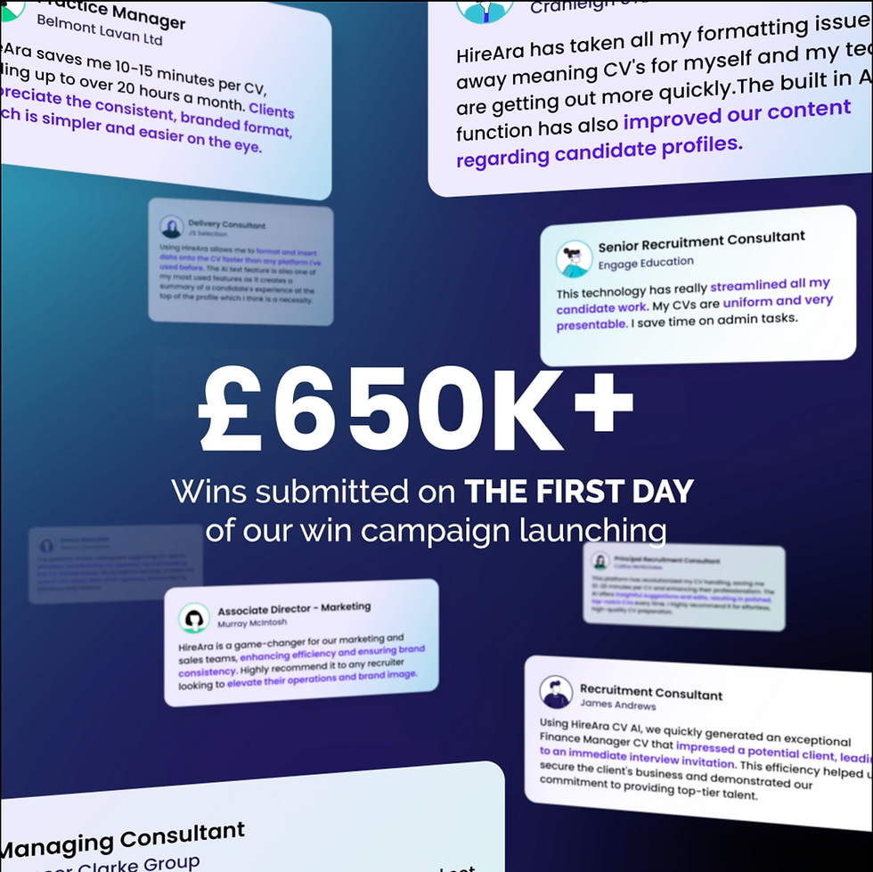
Brand in Action from Screen to Scroll
Product UI. I redesigned the product interface using the new visual language, building an customised icon library, to components, onboarding flows, and a unified user experience. The brand wasn't just on the product, it was in the product. Ran collaborative design sprints with the CEO, PM, and dev team, validated with sales and customer success, and even built my own CV in the product to map limitation firsthand.
→ [Read the full UI & Product Design case study]
Website. I owned the website end-to-end through four complete redesigns, each iteration carrying the brand system forward as the product and market evolved. The site shifted from login-first to demo-first, lifting the primary CTA by 41× across versions. By the final version, the website wasn't just on-brand. It was the strongest proof of what the brand could do.
→ [Read the full Website case study: Four Iterations, One Conversion Story]
Marketing content. Social templates, video content, sales enablement, email templates, ad creative, founder video series. I produced the full range and made sure every channel spoke the same language. A LinkedIn post, an ad click-through, the website, the product login. All of it needed to feel like the same brand.
→ [Check out the Marketing content case study]
Motion and video. The brand needed to move, not just sit still. I built a motion language from the logo animation outward: product explainers, founder thought leadership, customer testimonials, campaign films. The same visual identity carried through every frame.
→ [View the Motion & Video showreel]